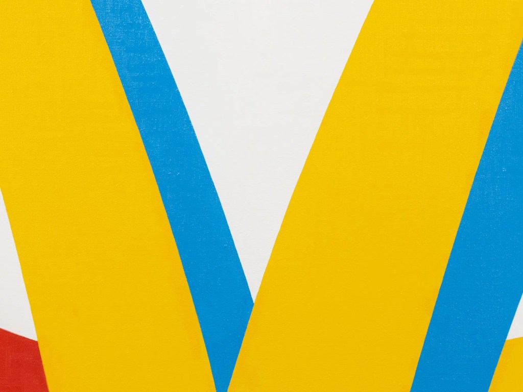
What Coventry does is reveal that high art lies behind the lowest-class areas of south London. The maps on every council estate in the UK, helping the pedestrian make sense of their non-traditional layout, are quite simply stripped of names, council logos and municipal colour schemes, and are rendered on white space in Malevich-approved bright primary colours.
Hatherly/Estates
Hatherly/Estates, 2013
In 2000 his Junk Series was partly inspired by the crushed, bent and discarded McDonald’s cartons he saw littering the high street near his Camberwell studio. He noticed that the yellow, red, and blue of the company’s visual identity at the time mirrored his own palette, originally inspired by the Russian Constructivists. “The initial idea was that it looked like suprematism – the colours are almost taken from that early 20th century movement. I’m interested in the idea that whenever people throw up challenging or difficult ideas capitalism just takes them and uses them to its own ends. So this McDonalds packaging looks like it’s taken this suprematist language, or Russian iconography but employed it to sell burgers.”
Anon/Phaidon
Leave a comment